Seven Seas Entertainment
COMPANY REBRAND
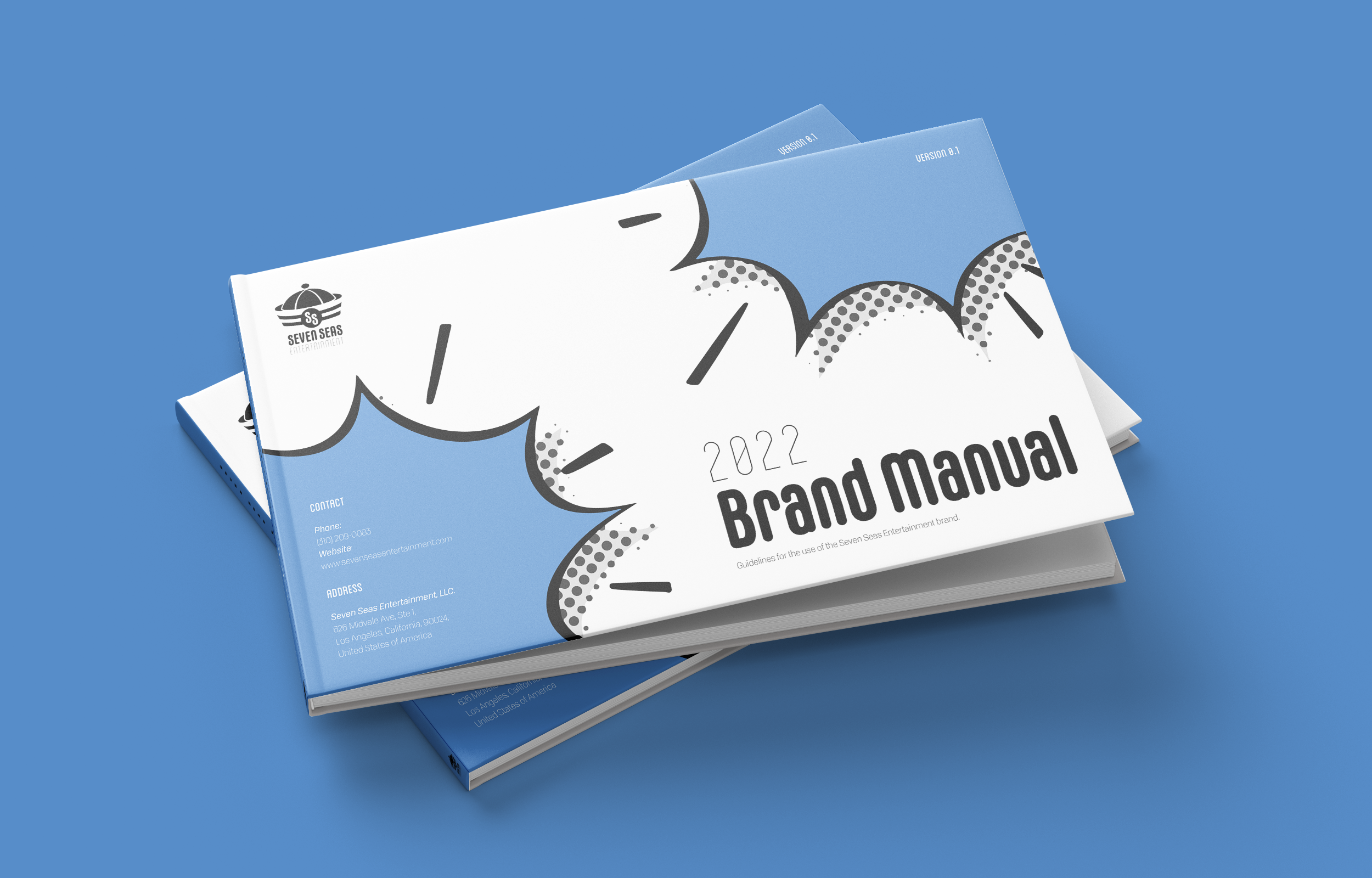
Seven Seas Entertainment is an award-winning publisher that specializes in bringing Japanese manga and light novels to English-language audiences. Formed in 2004, it is now the #1 independently-owned manga publisher in the English-language market. Despite its exponential growth, the brand fell out-of-touch with its contemporary audience. To revitalize its identity, the company’s rebrand pushed visual elements in a direction that better aligned with the brand’s mission, core values, and persona. For example, the new sailor hat logo symbol is clean and simple to comply with modern aesthetics. Subsequently, the hamster mascot redesign wears a sailor uniform, directly connecting it to the logo symbol to create a cohesive trademark. To clearly communicate the company’s rebrand, the brand manual details how to use the new visual elements in all future brand artifacts.
SOFTWARE:
Illustrator, InDesign, Procreate
SKILLS:
Copywriting, Illustration, Layout Design, Logo & Branding, Prepress


