HAISHI!
NATIVE APP
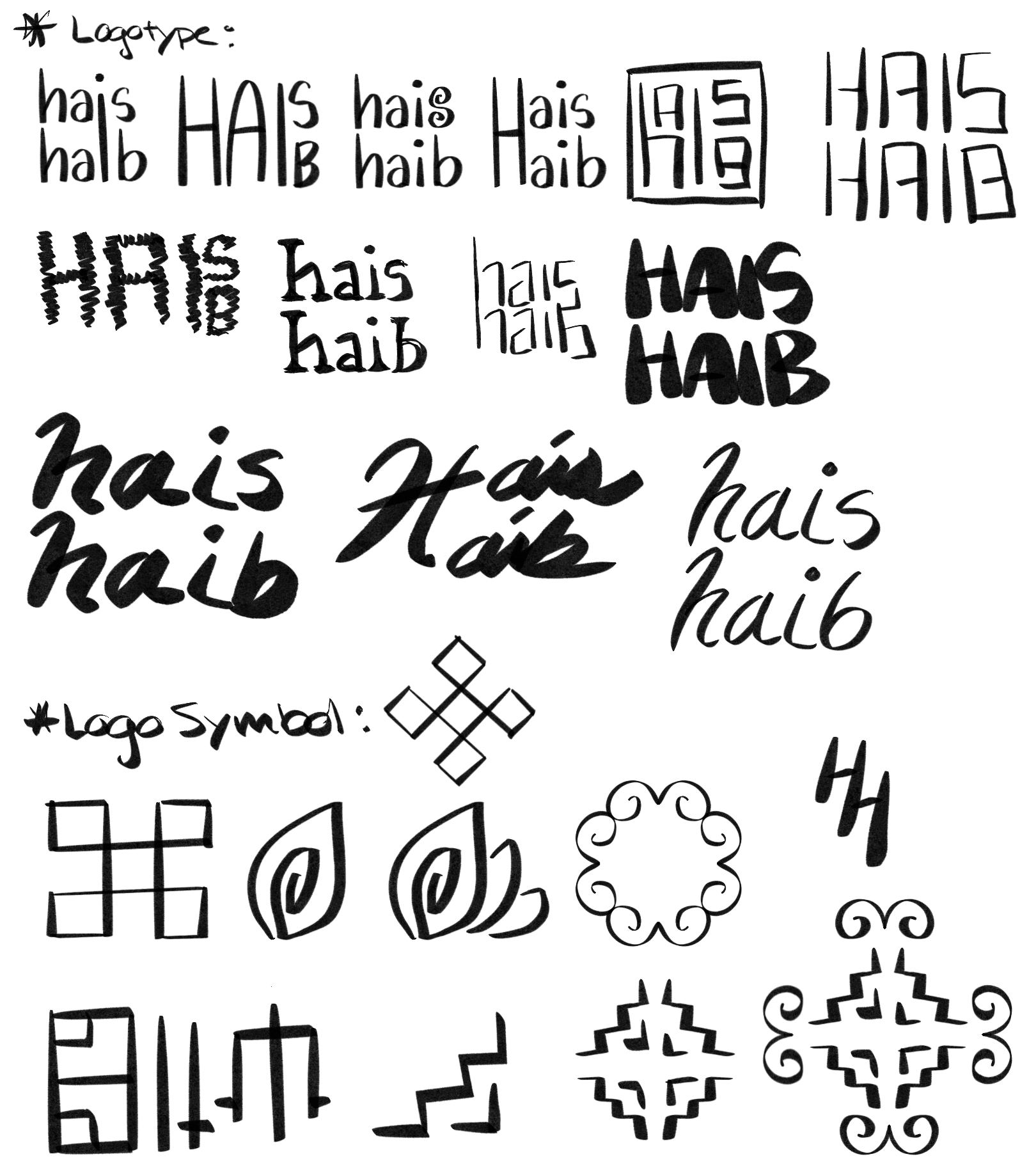
HAISHI! is a native app specialized in the Hmong language, featuring a translator, a dictionary, and the option to connect users to Hmong interpreters for real-time sessions. The app name is a combination of the Hmong word “hais” (meaning “speak”) and the english word “hi.” The logo symbol is a leaf motif found in traditional Hmong embroidery, representing nurture and growth. HAISHI!’s mission is to alleviate the burdens of and to improve the quality of life for Hmong people around the world.
SOFTWARE:
Figma, Illustrator
SKILLS:
Logo & Branding, UX & UI Design

Identifying the Problem
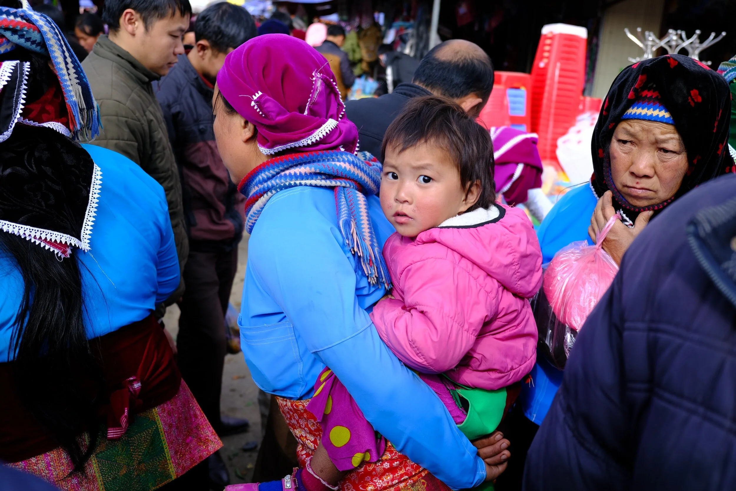
After the Vietnam War, there was a large influx of Hmong immigrants in the USA. Today, many 1st-generation Hmong immigrants still struggle with English despite having lived in the USA for several decades. Oftentimes, they need the help of their children or other family members with essential tasks of life, such as car inspections, 401K paperwork, and applying for EBT benefits. Unfortunately, these 2nd-generation immigrants also struggle with interpreting due to assimilation. Even with the advancement of online translators today, many do not have Hmong—and in the rare times that they do, the translation is often unreliable and has no audio feature.
Understanding the Target Audience
To better understand the target audience and the challenges they face, interviews were conducted on a small group of 1st and 2nd generation Hmong immigrants in the USA. User personas summarizing the information collected represent the two different primary users. User journey maps outlining their actions through the app’s functions help determine how the app’s features and design could improve to become more useful and valuable to the Hmong American community.
Establishing the Brand Identity
Prior to designing the app’s user interface, a brand identity must be established to utilize in all subsequent artifacts. The images below display the ideation, mind-mapping, and sketches completed to explore potential solutions before finalizing the brand’s kit-of-parts. Existing competitors in the market were also studied. From this research, it was concluded that of the few resources available for the Hmong language, many are out-dated with interface designs that lack intuition. The goal of the new app design is to create a user interface that is simple and easy to navigate, much like the successful translation app developed by Google.
Designing the User Interface
Designing a user interface is a long process of multiple trials, feedback, and improvements. To clearly visualize the app’s structure, an information architecture map outlines the flow from one wireframe to another. Paper prototypes test initial user reactions to eliminate ideas that may not be suitable early in the design process. From these sketches, low-fidelity wireframes are drafted to present the basic layout and plan before moving forward to the advanced stages of the design process. Finally, high-fidelity frames capture the look and feel of the product, containing actual content, typefaces, colors, image dimensions, and branding elements. A style guide instructs other designers on how to use the brand’s kit-of-parts and other relevant components throughout the app.
The Final Design
After the long and arduous process, the final design is complete with a clean and efficient interface, allowing users to quickly use the app to solve their English or Hmong language struggles, so that they may be able to enjoy life to its fullest potential.


